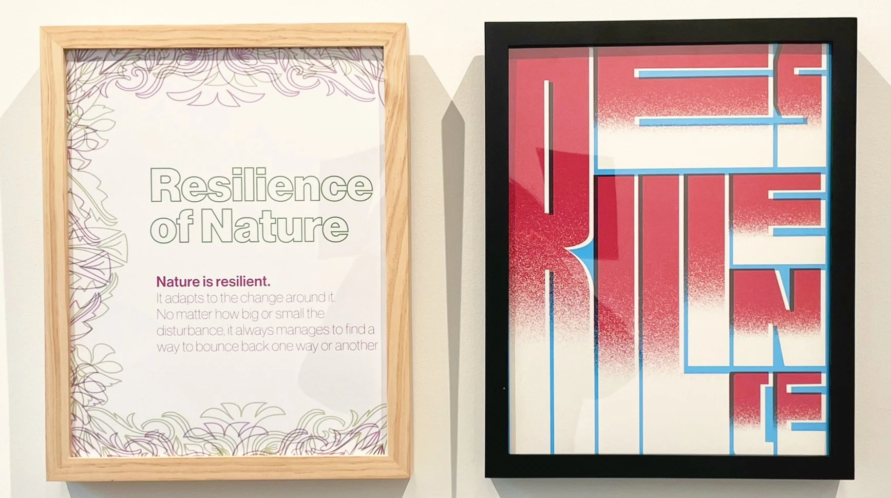
Resilience
I made blocky letters out of “resilience”. I wanted it to appear almost like a puzzle. I wanted to show how the word could look sturdy and fit together as one. I used the colors red, white, and blue to give both a warm and cool feel to piece. I created a misaligned look with each of the colors to reflect the look of screen printing.
Resilience of Nature
I wanted to create something more simplistic. I used muted and earthy tones to reflect nature. I used some thin and some bold typefaces to represent different aspects of nature. I chose to focus on the resilience of nature. I wrote a few sentences about how nature is resilient and adapts to change. I created a nature inspired border to frame my type.
Photo from exhibition below.


